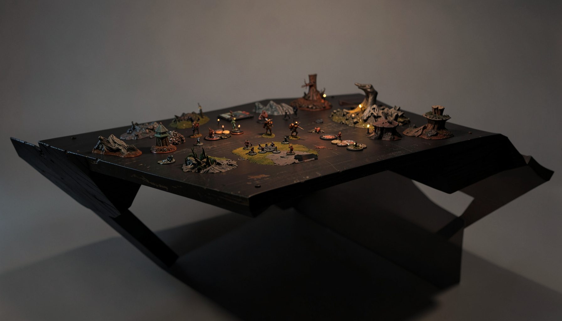
Live-streamed games, recorded matches, and event data gathered in one place.
Kill Team Stream hosts quality live streaming of Kill Team content — tournaments throughout the year on Twitch, regular games streamed to the channel, and tournament data gathered so players can see what's happening in the scene. Powered by WARHAMMER.
Browse tournamentsOfferings
Tournaments
Multiple Kill Team tournaments hosted throughout the year, all live-streamed on our Twitch channel.
Videos
Streams are recorded and uploaded to YouTube alongside original video content we produce.
Event Data
Tournament packets from past events plus resources for upcoming Kill Team tournaments.
Site Directory
How to Design a Kill Team Tournament Logo That Stands Out
A tournament logo is often the first sign that an event has a distinct identity. It appears on registration pages, stream overlays, social posts, player packs, terrain labels and winner announcements. For a Kill Team event, the design also needs to communicate speed, tactical depth and a shared connection to the Warhammer community without becoming difficult to read.
The strongest marks work at several sizes. A viewer should recognise the emblem on a Twitch overlay, while a player should still be able to identify it on a small badge or event token. This makes restraint just as valuable as creativity. A detailed illustration may look impressive on a poster but disappear when reduced to a mobile thumbnail.
Tournament branding also has a practical role. It helps players distinguish one event from another, gives commentators visual material to reference during a broadcast and makes results feel connected to a particular occasion. A clear logo can turn a local competition into something that looks established and memorable.
Australian events have an especially varied visual environment. A tournament in Melbourne may compete with a busy convention calendar, while an event in Brisbane, Sydney or Perth may need branding that works across venue posters, Discord announcements and livestream graphics. The design should feel local when appropriate, yet remain flexible enough for players travelling from other states.
Define The Event’s Competitive Character
Start by deciding what the tournament should feel like before opening a design program. A relaxed club event might suit a friendly badge, bright accent colours and approachable lettering. A major regional competition may call for a sharper crest, stronger contrast and a more serious visual system. The logo should reflect the event’s actual atmosphere rather than pretending every tournament is an elite championship.
Useful adjectives can guide early decisions: covert, industrial, brutal, fast, disciplined, experimental or welcoming. Select two or three and use them as a filter. If a proposed symbol or colour does not support those qualities, remove it. This prevents the common problem of combining skulls, weapons, dice, faction icons and tactical maps until the mark becomes visually crowded.
Consider the audience as well. New players may respond to a recognisable game reference, while experienced competitors may value a polished identity that feels different from generic gaming artwork. A tournament streamed through Kill Team Stream needs to appeal to viewers who encounter it briefly between matches, so instant recognition matters more than hidden details.
A strong concept usually contains one central idea. It might be a stylised deployment zone, a compact helmet silhouette, a signal marker, a tactical grid or an abstract clash between two shapes. Avoid copying official faction insignia or existing event marks. Inspiration from the setting is useful, but the tournament needs its own identity and should not imply official endorsement.
Build A Mark That Survives Every Format
Begin with a black-and-white version. If the logo loses its meaning without colour, its structure may be too dependent on decoration. A tournament emblem should remain identifiable on a monochrome printer, a sponsor document or a low-quality venue photocopy. Strong silhouettes, clear spacing and a recognisable outer shape are more reliable than tiny highlights.
Develop at least three versions: a primary lock-up, a compact badge and a simple wordmark. The primary version can combine the event name and symbol. The badge should work as a profile image or stream corner graphic. The wordmark is useful for narrow banners, standings pages and merchandise where a large emblem would take up too much room.
Test the designs at realistic sizes. View them at approximately 24 pixels for a social avatar, around 100 pixels for a stream overlay and at poster scale. Ask whether the event name remains legible and whether the symbol still has a distinct outline. A logo that only works at A3 size will create problems across digital platforms.
Typography deserves particular care. Military stencil fonts are tempting, but many are difficult to read and resemble one another. A sturdy sans serif with one unusual modification can feel more distinctive. Consider customising a letter, cutting a counter-shape into the wordmark or using a small tactical marker as punctuation. Keep the event name readable before adding atmospheric styling.
Choose Colour And Type With Purpose
Colour can distinguish a tournament from the visual noise of gaming feeds, but the palette should have a job. Two dominant colours and one accent are usually enough. For example, charcoal and bone can establish a tactical foundation, while orange, teal or magenta can identify the event and draw attention to match information.
Check contrast against both light and dark backgrounds. Australian venues often have mixed lighting, and an event logo may be displayed on a projector, a banner near a window or a phone screen in bright daylight. A subtle grey-on-grey design can look refined on a monitor yet become unreadable in a community hall.
| Design element | Practical choice | Why it helps |
|---|---|---|
| Primary symbol | One bold silhouette | Recognisable in avatars and overlays |
| Colour palette | Two core colours plus one accent | Easier to reproduce and remember |
| Typeface | Heavy, readable sans serif | Keeps names clear at small sizes |
| Supporting texture | Used sparingly | Adds atmosphere without harming legibility |
| Safe space | Visible margin around the mark | Prevents cropping on streams and posts |
| File set | SVG, PNG and monochrome versions | Supports print, web and video use |
Typography and colour should work together rather than compete. If the emblem is complex, keep the lettering quiet. If the wordmark has a distinctive custom treatment, use a simpler symbol. This balance helps the logo remain useful on player packs, event schedules and match cards.
When selecting colours, consider production costs and local suppliers. A small Melbourne or Adelaide organiser may print only a short run of shirts and posters, while a larger Sydney event may order signage, medals and sponsor walls. A palette that relies on several gradients or metallic effects can be expensive to reproduce consistently.
Add Local Identity Without Making It Gimmicky
An Australian tournament can reference its location through restrained visual cues. A coastal event might use a heat-haze accent or navigation motif, while a Canberra competition could draw on geometric civic forms. A Perth organiser may want a palette that feels connected to the west without placing a literal landmark in the middle of the logo. Subtle references often age better than obvious souvenirs.
Local habits can influence practical applications too. Many players discover events through Facebook groups, Discord servers and Instagram posts rather than printed advertising. The logo should therefore have a square crop, a horizontal version and enough contrast for quick viewing on a phone. A badge that works in a group chat can become a useful shorthand for the tournament community.
Think about how the identity will appear during the event day. Players may be carrying coffee, checking pairings between rounds and moving around a crowded venue. A large, simple logo on a registration desk or directional sign is more helpful than a delicate illustration hidden in a dense graphic. If the tournament is in a hot city such as Brisbane or Darwin, water stations and shaded areas may carry event signage where sunlight affects colour perception.
The Australian market also rewards adaptable branding. Hobby stores, independent clubs and convention organisers often collaborate across a limited budget. A logo that can be printed by different suppliers, embroidered on a cap or cut as a vinyl decal is more valuable than one designed only for a premium agency package.
Protect The Identity Before Publishing
Before announcing the event, search for similar tournament logos, club badges and gaming brands. Check social platforms, event directories and the Australian trade mark database. A mark that seems original within a local group may already be associated with a gaming business elsewhere. Early research is cheaper than changing banners, shirts and stream graphics after launch.
Ownership should be clear when a freelance designer, club committee or sponsor contributes to the project. Put the agreed rights in writing, including whether the organiser may alter the logo, use it on merchandise and license it to future events. Save editable source files and record the approved colour values, fonts and spacing rules.
Australian Consumer Law is relevant when branding makes claims about an event. Avoid wording or symbols that could mislead players about official status, sponsorship, prizes or affiliation. A tournament logo should not suggest that Games Workshop, a faction manufacturer or another organisation has endorsed the competition when it has not.
Trade mark registration is a separate decision from copyright ownership. If the event is expected to become a recurring series, professional advice from an Australian intellectual property specialist can help assess the name and logo before investment grows. The key point is consistency: use the same spelling, symbol and approved colour treatment across the website, registration page and broadcast assets.
Prepare The Logo For Broadcast And Community Use
Livestreaming changes the requirements of tournament branding. A commentator may need the logo to sit beside player names, round information and sponsor marks without dominating the match. Prepare a transparent PNG, a vector file and a version with extra clear space for overlays. Avoid fine lines that flicker or vanish after video compression.
Create a small brand kit for organisers and media partners. Include the primary logo, compact badge, light and dark versions, colour codes, recommended background colours and minimum size guidance. A one-page guide can prevent a sponsor from stretching the mark or a volunteer from placing yellow lettering over a pale background.
The identity can support educational content as well as promotion. Match thumbnails might use the badge with faction names, while recorded games can place a compact mark in the corner. Results graphics, standings and event photos become easier to recognise when they share the same accent colour and typographic treatment. This is particularly useful for an ongoing video archive.
Tournament branding should also be able to respond to the competitive conversation. As players assess roster choices, mission priorities and possible restrictions, event coverage benefits from visual consistency. A well-made logo can sit naturally beside ban-cycle analysis or a strategy discussion without making the broadcast feel like a collection of unrelated graphics.
Test The Design With Real Players
Show the first concepts to people who understand the game and people who do not. Experienced players can identify whether a symbol feels too close to an existing faction or community mark. Newcomers can reveal whether the logo communicates a welcoming competition or looks like a private club. Both perspectives matter when the event aims to grow.
Ask testers to identify the logo after seeing it briefly among other images. Ask them to read the event name on a phone and describe the mood it creates. Avoid asking only whether they “like” it, because personal taste can distract from useful information about recognition, clarity and suitability.
Use real applications during testing. Place the mark on a mock Twitch overlay, a social announcement, a printed pairing sheet, a shirt, a venue sign and a result graphic. Check whether the logo competes with player names or becomes too small beside sponsor details. If it works across these settings, it is much more likely to remain useful throughout the tournament cycle.
The final design should feel distinctive without demanding explanation. Players should recognise it quickly, organisers should be able to reproduce it accurately and viewers should associate it with a particular standard of competition. That combination of clarity, flexibility and local character gives a Kill Team tournament identity room to grow from a single event into a respected part of the Australian scene.
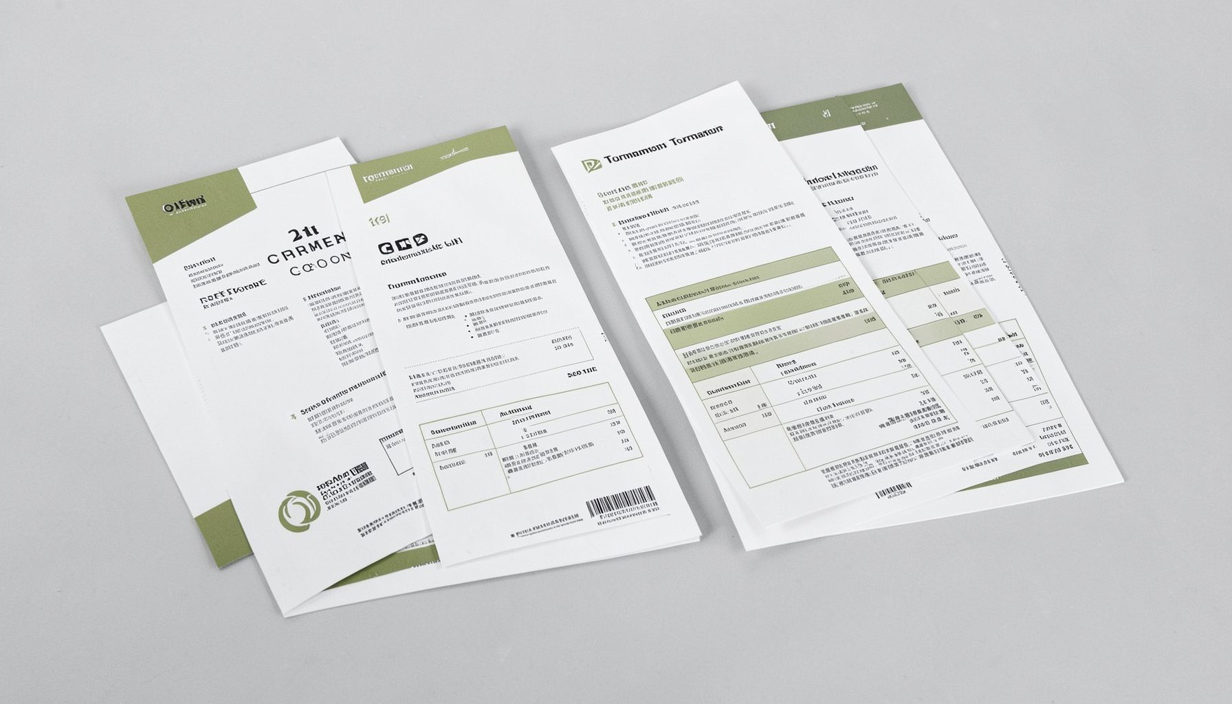
Tournament Packets
Packets from previous Kill Team events are kept here alongside new packets for upcoming tournaments, so organizers and players have what they need in one place.
View Event Data